


I was a bit misty eyed during the week after reading of the death of Hermann Zapf. Zapf was a typographer and font designer. He gave us the widely used Palatino typeface, Optima (one of my favourite fonts) and the Zapf Dingbats (you’ve probably used some of them), amongst others.
To be honest I hadn’t heard of Zapf before. What made me go all nostalgic was the thought of what this 96-year-old had seen over his life and that he will continue to make his mark, via his fonts, for many years to come.
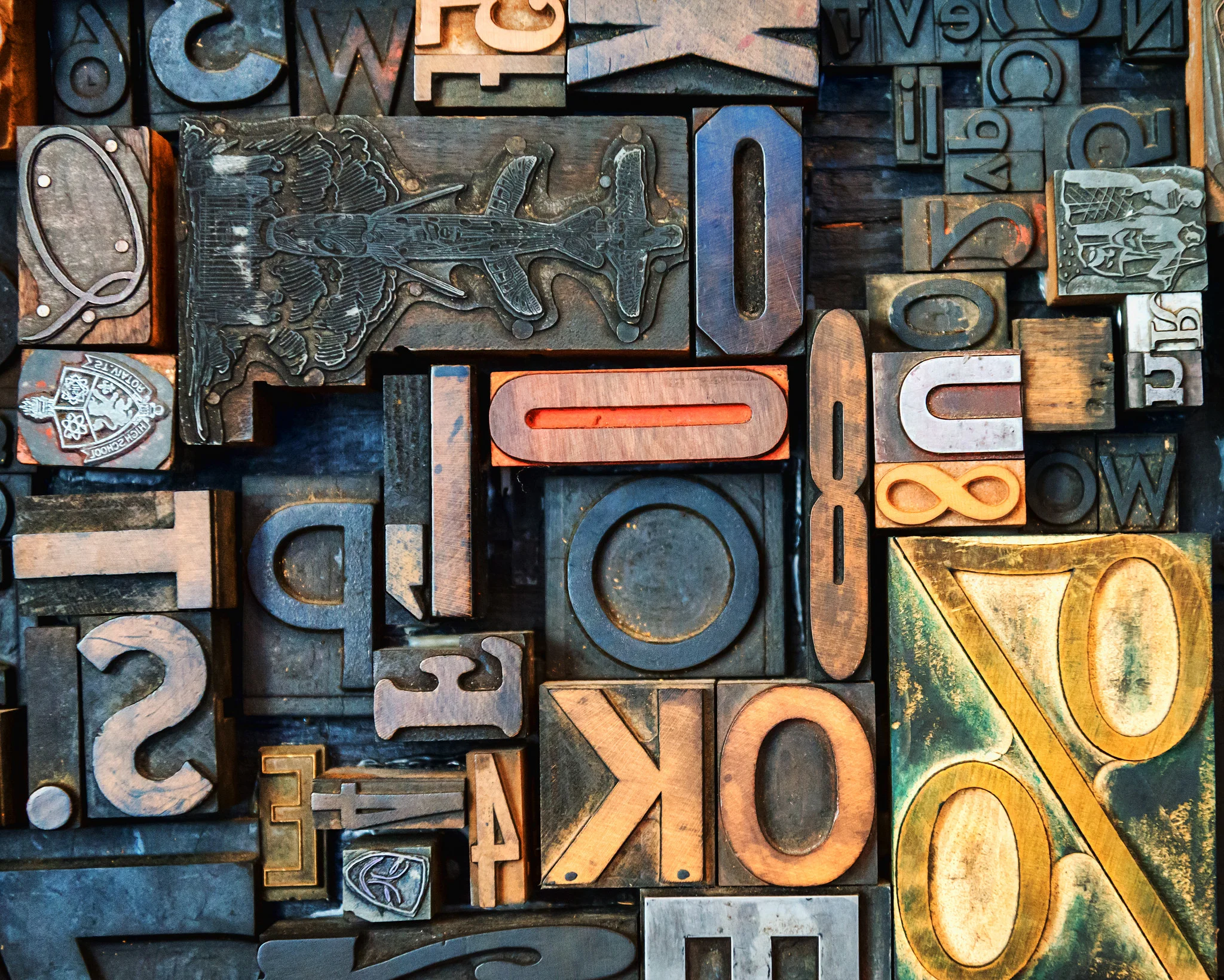
I’ve always loved a good font. However, as a writer I’m also aware of the potential dangers of being a ‘fontoholic’. Believe me, there are a lot of fonts out there if you go looking for them.
Here are the five strategies I use in order to manage this condition.